Introducing a new face of Quartr
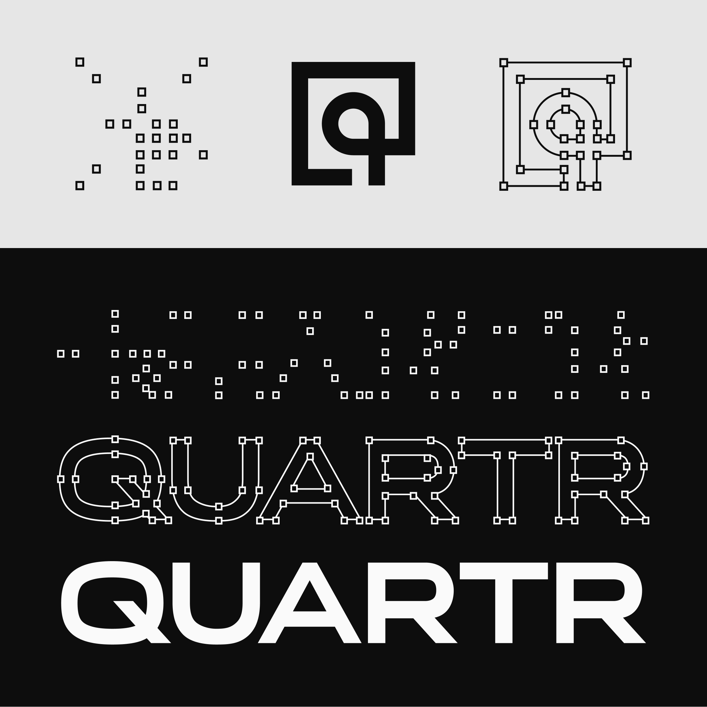
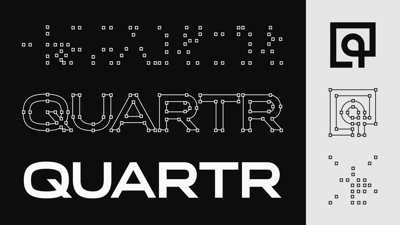
Today, we're introducing the most significant change to the Quartr brand since inception – a new logo built to survive the next hundred years. A year and a half of on-and-off attempts, several false starts, and plenty of frustration. Here's why we did it, what shaped our thinking, and what the new logo actually means.
Outgrowing our past
The original Quartr logo was created in early 2021, before we had a viable business plan, before we'd identified our ideal customer profiles, and before we decided to build something truly global. It was made in the earliest, most uncertain days of the company, during the development of our iOS beta app. Before building our web app and our API. It was created together with a close art director friend and felt like a fitting face for what Quartr was back then.
Five years later, a lot has changed. Today, Quartr is a B2B enterprise business serving the largest and most demanding financial institutions and technology companies in the world. We provide the AI infrastructure for company research. We've grown from a handful of people into a team of 150+ spread across Stockholm, Gothenburg, New York, and Dublin. Our customers expect nothing but precision. We needed a new logo that matched what the company had actually become.
Timeless, confident, familiar
Five words we thought a lot about during this process were timeless, practical, confident, different, and familiar. Timeless enough to outlast trends, meaning that it could pass for something designed in 1842, 1977, 1995, or yesterday. Practical enough to work at any size, in any situation. Confident enough to signal trust on first look. Different enough to stand out in our own niche, yet familiar enough that our customers recognize the visual language. Meeting all of that at once is where things got hard.
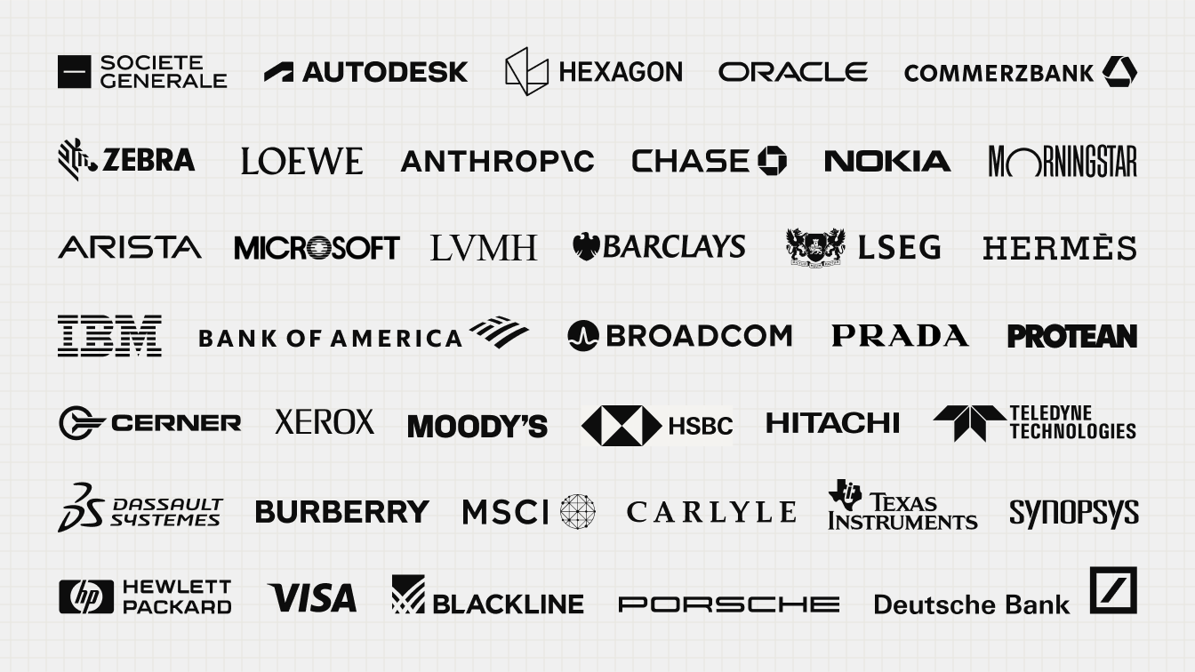
We identified three main groups of companies whose logos we believe carry one or more of those qualities. Established enterprise technology and industrial names like Autodesk, Hexagon, and Oracle, for their sense of scale and permanence. Luxury brands like Hermès, Loewe, and Prada, for their sense of heritage and elegance. Financial institutions like Deutsche Bank, Barclays, and Moody's, for the trust and industry recognition they carry.
Different as they were from each other, they often shared a visual language. Capital letters. Wordmarks strong enough to stand on their own, without needing an icon to be recognizable. Logomarks treated as separate, more sparing assets rather than a permanent sidekick to the name. Geometry that favoured sharp precision over roundness. However, knowing what we wanted didn't make it easy to find.
The long and winding road
Over the last year and a half, we have gone through what feels like a million internal variations, and multiple rounds with a few select outside freelancers and studios. It became one of those projects we'd throw ourselves at for a few weeks, hit a wall, then deliberately step back from until we had the distance to see it clearly again. Sometimes we came close, but something was always missing. Twelve months in, nothing that we had was good enough to ship. Then Fons Mans at Offgrid, based in Rotterdam, reached out again. Having done four previous rounds with us with no luck, apart from a wordmark we really liked, we were surprised that he offered to give it one last try on the house.
We finally cracked it together, but not in round five. Before the sixth and final round, we had almost given up. During a Slack huddle to regroup after another setback, we aimlessly looked through our massive Figma sandbox for this project, and one mark jumped out. There it was. Ironically enough, it was a mark from the second round with Offgrid, but we had altered it slightly – changing the inner square to a circle. For some reason it didn't resonate back then, but now it did. Some final alignment between the word- and logomark, and here we are.
Built to last
The new wordmark is sharper, wider, and far more confident than what came before it. Less chunky, less friendly, more grown up. The most visible change is the shift to capital letters, which does a lot of the work on its own. It reads as serious and trustworthy in a way lowercase never quite manages.
As for the logomark, it needed to be simple enough to work at any size, familiar enough to feel instantly legible, and fresh enough not to feel derivative. We've also separated the logomark from the wordmark entirely, to not be used together. Each one carries its own weight now, by design.
Even though a visual meaning in the logomark wasn't a requirement, we feel that the square outline represents quantitative research (“numbers”) and the round core qualitative research (“narratives”), which is the intersection in company research where Quartr operates. Tilt your head and it also reads as an eye, which fits a company built on focus and insight. A few of us have already started calling it the Quartr Eye. And the corner that dissolves into a curve carries its own logic. A nod to the quarter of a year itself, with the open edge suggesting that any single quarter is only ever part of something longer. Fitting, for a company built around long-term thinking.
Versatility mattered as much as the shape itself. A logo that only works on a homepage isn't built for a company like Quartr. It has to hold up at business-card size and at roof-sign size, in black and in white, stitched into fabric or shrunk to a sixteen-pixel favicon. A logo built for scale.
We truly admire Offgrid's patience with us and are thankful that they saw this project through to the end. We really feel the final logo passes our "1842, 1977, 1995, or yesterday" test, and believe it's solid enough to outlive us.
Oliver Hamrin
Haris Cehic
–––
Make the switch
If you're a partner, an integrator, or anyone else currently displaying our old logo, you'll find the new logo, usage guidelines, and downloadable files at quartr.com/brand. We'd appreciate you making the switch sooner rather than later. Reach out to oliver@quartr.com if you have any questions.